Mobile Usability vs. Desktop Usability - Key Distinctions Unveiled
In the rapidly evolving digital landscape, usability testing plays a crucial role in ensuring the optimal user experience across various platforms. One such platform that requires unique considerations is the mobile environment. This article explores the key differences between mobile and desktop environments and how they impact usability testing.
**Screen Size and Layout**
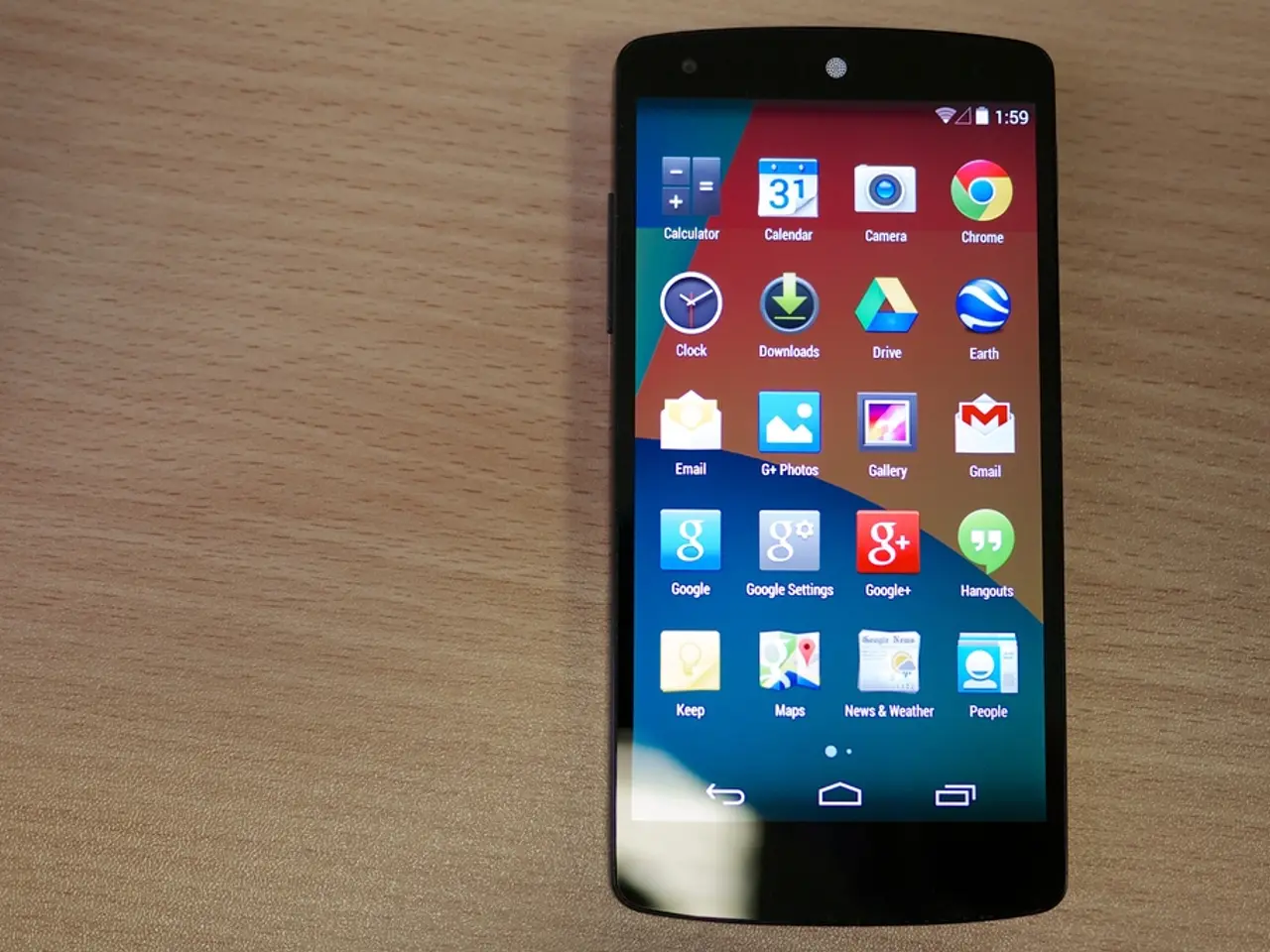
Mobile devices, with their smaller, varied screen sizes and orientations, necessitate responsive design to ensure content fits well and remains readable. Desktop screens, on the other hand, are much larger and come in a broad range of sizes. Mobile usability testing must consider font sizes, button sizes, and layout adjustments to avoid issues like content overflow or touch target misalignment.
**Navigation and Interaction**
Mobile navigation differs significantly from desktop, relying on touch-friendly gestures and simpler navigation due to limited screen space. Desktop navigation often uses precise cursor control and larger interactive elements. Mobile usability tests must mimic touch interactions, gestures, and consider one-handed use scenarios, while desktop tests focus on keyboard and mouse interactions.
**Hardware and Operating System Fragmentation**
Mobile devices are highly fragmented across models, screen sizes, and OS versions, but hardware is usually less variable compared to desktops. Desktop environments see a wider range of hardware differences, including display refresh rates, RAM allocations, and peripherals, alongside diverse operating systems. Usability testing on desktop must account for this extensive hardware and OS diversity, potentially requiring multiple test setups.
**User Behavior Differences**
Mobile users tend to have higher bounce rates and shorter attention spans due to on-the-go usage, while desktop users often spend longer per session and may engage in more complex tasks. Mobile usability testing may focus more on quick task completion and ease of use, while desktop testing might emphasize feature richness and multitasking capabilities.
**Content Optimization and Feature Behavior**
Mobile layouts and content often need to be optimized for touch and screen size constraints, whereas desktop applications can use more complex layouts and detailed content. Functionality may behave differently across devices, requiring separate validation for mobile features reliant on touch or sensors.
In summary, usability testing for mobile environments prioritizes touch-based, small-screen navigation, responsive content, and device compatibility across varying hardware and OS versions. Desktop usability testing must accommodate larger, diverse screen sizes, varied hardware and OS configurations, and traditional input devices. These differences necessitate adapted usability testing strategies tailored to the specific environment to ensure optimal user experience.
Researchers can employ various tools and techniques to simulate real-life conditions in the lab, such as using treadmills and walking courses with obstacles, playing music/video in the background, and employing stop-start techniques. Mobile user research methods can be found in Lorraine's article on Mobile User Research Methods, and additional tools can be found in "13 Testing Tools for Mobile UX."
While field research offers valuable "real-world" insights, lab research can also be valid when steps are taken to create realistic field conditions. Four free tools for capturing data in mobile usability research are UXCAM, Watchsend, Userzoom, and Skala Preview. These tools offer a range of features, from screen capture and facial emotion capture (with user consent) to testing tap point sizes and ergonomic functions.
Heuristic evaluations are still applicable to mobile usability research, but additional heuristics specific to the mobile environment should be considered. The mobile environment is different from the traditional desktop environment due to factors such as constantly changing user context, varying location, attention span, connectivity, and device handling.
In conclusion, understanding and adapting to the unique challenges and opportunities presented by the mobile environment is essential for effective usability testing. By employing tailored strategies and tools, researchers can ensure that mobile applications provide a seamless, enjoyable user experience.
[1] Nielsen, J., & Tahir, A. (2012). Mobile usability: A different ball game. Alistair Cockburn on Agile Software Development. [2] Polo, M., & Borredal, R. (2014). Mobile Usability Testing: A Review of the Literature. International Journal of Human-Computer Studies, 72(1), 24-39. [3] Zhang, L., & Xu, J. (2015). A Comparative Study of Mobile and Desktop Web Usability Testing: Methods, Tools, and Challenges. Journal of Web Engineering, 16(1), 1-18.
- To optimize UI design for a sustainable-living lifestyle app that also involves home-and-garden activities, user research should consider the smaller screen sizes and touch-based interactions unique to mobile devices, ensuring the app is easy to navigate and responsive.
- In the context of data-and-cloud-computing applications, desktop environments might be more suitable due to their larger screen sizes, allowing for more complex layouts and detailed content, while ensuring compatibility across various hardware and OS configurations.
- User research for lifestyle apps targeting a younger demographic, who may primarily use mobile devices, can benefit from employing real-life conditions in the lab, such as simulating on-the-go usage with treadmills and obstacles or using stop-start techniques, to better understand user behavior.
- As technology advances and users increasingly adopt home-automation solutions that integrate with mobile devices, the mobile environment will require further investigation to ensure seamless and enjoyable user experiences, particularly concerning device compatibility, touch-based interactions, and ergonomic functions.


