The Development and Significance of the Double S Mark
The double S symbol, also known as the ss ligature or the Eszett in German typography, is a fascinating relic from the evolution of written language. This symbol, historically significant in its representation of the sharp "s" sound, has played a crucial role in the development of typography and continues to hold relevance today.
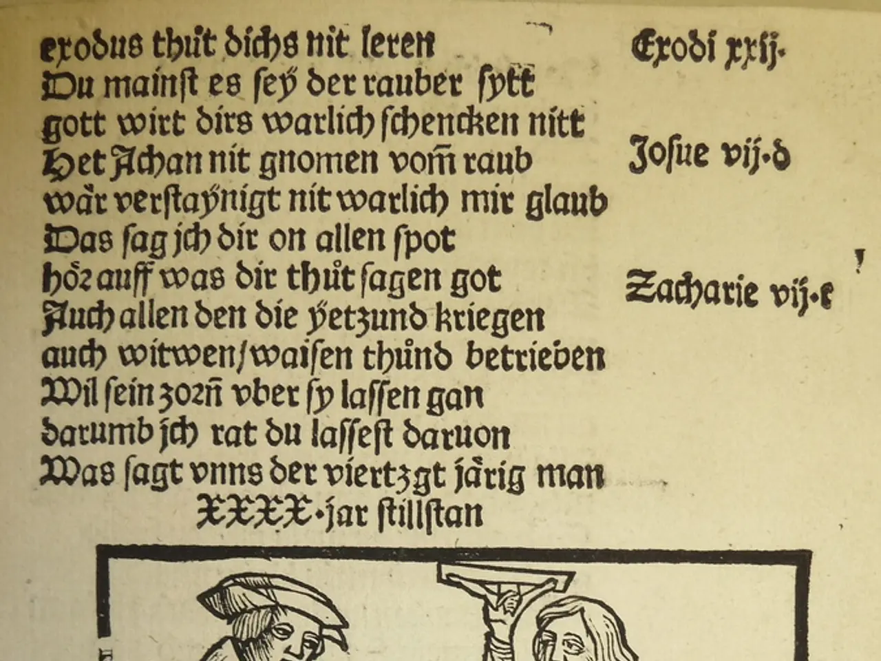
Originating as a combination of the long s (ſ) and the normal s, the double S symbol was first used in Germanic languages to simplify writing and printing in the Middle Ages. In German script styles such as Fraktur, this ligature consolidated two characters into one for both aesthetic and practical reasons.
Before the double S symbol, the "ss" sound was written as two separate letters "s." However, the double S symbol gained popularity in Germanic languages and spread throughout Europe, particularly in contexts where clarity and legibility were paramount.
In German orthography, the double S symbol was used to replace the double "ss" in certain phonetic and morphological contexts to aid clarity in reading and pronunciation. Before the 1996 German spelling reform, the Eszett was used whenever the letter combination "ss" occurred at the end of a syllable or word, adding a nuanced distinction in meaning and pronunciation. Post-reform, its use was standardized mainly after long vowels and diphthongs.
In modern usage, the Eszett remains a distinctive letter in standard German orthography. However, it is unique in that it has no uppercase form traditionally, so in all-caps texts, "ß" is replaced by "SS." Unicode added an uppercase version (ẞ) in 2008, and since 2010, its use in official all-cap names in Germany is mandatory. This uppercase form was formally integrated into German orthography in 2017.
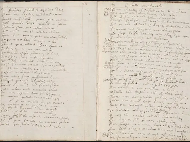
Beyond German, ligatures like the double S have fallen out of common use in modern typography. The advent of printing and digital typesetting favored straightforward, separate characters rather than ligatures because of mechanical and technological constraints. However, the double S symbol continues to be encountered in historical texts, particularly those written in early modern English or other European languages.
In graphic design, the double S symbol is occasionally used in decorative typography or in representing historical terms and names. Its historical significance often leads to its inclusion in modern typography, particularly in logos, book covers, or other creative projects to evoke a sense of nostalgia or historical authenticity.
In conclusion, the ss ligature (ß) remains historically significant as a specialized German letter derived from ligature practices aimed at phonetic clarity. While it has largely been replaced by standard letter pairs in modern typography, the double S symbol continues as a specific orthographic character in German with controlled contextual use and typographic adaptation to accommodate digital text standards and uppercase needs. The enduring legacy of the double S symbol serves as a reminder of the ongoing importance of legibility in written texts and the evolution of typography throughout history.
References: 1. The Double S: A Historical Perspective 2. The Eszett: History, Use, and Evolution 3. Long S and Double S in Printing
The double S symbol, even though it has been mostly replaced by standard letter pairs in modern typography, is still a specific orthographic character in German, particularly found in references to its historical significance and legibility in written texts. In home-and-garden contexts, such as graphic design and decorative typography, the rare use of the double S symbol, or Essett, can add an element of lifestyle that evokes nostalgia or historical authenticity.


