
Three-Color Combinations Offer Stability: A Color Expert Discusses How Triadic Color Schemes Provide Harmony for Vibrant Hues
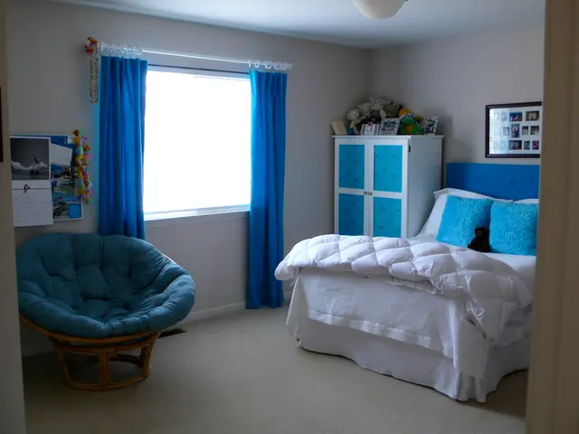
In the realm of interior design, a triadic color scheme is a captivating and balanced approach to creating vibrant and harmonious spaces. By evenly distributing three colours around the colour wheel, this method provides a lively atmosphere without overpowering the room.
To apply triadic color schemes effectively, it is essential to strike a balance between saturation and intensity. Rather than relying on bold, saturated triadic colours like bright red, yellow, and blue, opt for softer, muted shades such as terracotta, ochre, and inky blue. These choices create a layered and comfortable atmosphere suitable for interiors.
Playing with tints and shades can further soften the intensity of the colours, making them more natural for living spaces. Adding white (tints) or black (shades) to the triadic colours can help achieve a nuanced effect that mirrors how colours behave in the real world, rather than relying on sharp, digital hues often seen in graphic design.
Incorporating plenty of white or neutral space allows the triadic colours to pop without overwhelming the eye. For example, pairing darkened triadic colours with white walls or trims creates a calm backdrop and focal points in the room.
When it comes to texture, combining triadic colours with natural materials enriches the space and grounds the colours. This is particularly true in styles like Scandinavian design, where combining triadic colours with wood, woven fabrics, ceramics, and other natural materials creates a serene yet interesting environment.
To maintain harmony, it is recommended to use one triadic colour as the dominant hue, the second for accents, and the third sparingly to create focal points or highlight architectural features or furniture. This hierarchy keeps the scheme from feeling chaotic and ensures a harmonious balance.
A summary table of the best practices for using triadic color schemes in interiors is provided below:
| Aspect | Recommended Approach | |---------------------|-------------------------------------------------------------| | Color Choices | Muted or deeper triadic tones (e.g., terracotta, ochre) | | Intensity Control | Use tints and shades to soften colours | | Balance | Combine with neutrals/white space | | Texture | Add natural textures for depth and calm | | Color Hierarchy | One dominant, one secondary, one accent color |
Triadic colour schemes offer a sense of balance, harmony, and contrast, making them an appealing choice for those seeking to create dynamic yet balanced interiors. It is essential to remember that rules can be broken, and it is possible to mix a very muted version of one colour with a bold, saturated version of another.
Older colour models, such as those created by Phillip Otto Runge, can provide a more intuitive and natural relationship to colour and reflect how colour behaves in the real world. Examples of muted paint shades that can be used to create beautiful rooms with enough structure to hold the room together include 'Bone China Blue - Mid' by Little Greene, 'London Brown' by Edward Bulmer, 'Lichen' by Farrow and Ball, 'Henna' from the Beata Heuman range by Mylands, 'Thunder' from the same range, and 'Wheatsheaf' from the same range.
When using triadic colour schemes in interiors, it is not necessary to paint the room three different colours. Other methods for incorporating triadic colours include using them in artwork, flooring, or marble elements. Examples of triadic colour schemes in interiors include Red-Orange, Yellow-Green, Blue-Violet (Tomato, Soft Lime, Indigo), Yellow-Orange, Blue-Green, Red-Violet (Raspberry, Amber, Aqua), and others.
Finally, the 60-30-10 rule is a useful way to think about proportion and balance when working with more than one colour in interior design. It suggests that 60% of the room's colour should be the dominant colour, 30% should be the secondary colour, and 10% should be the accent colour. This rule can help ensure that the room maintains a cohesive and balanced look while still incorporating a variety of colours.
- By selecting muted shades like terracotta, ochre, and inky blue for a triadic color scheme, one can create a comfortable and layered interior atmosphere, similar to older color models reflecting the natural behavior of colors.
- Using the 60-30-10 rule in interior design can aid in maintaining balance and cohesion when working with multiple colors, such as those found in triadic color schemes.
- Instead of painting a room in three different triadic colors, consider incorporating them through artwork, flooring, or marble elements for a subtler approach.
- To embody the essence of Scandinavian design, combining triadic colors with natural materials like wood, woven fabrics, and ceramics creates a serene yet intriguing interior setting.
- In the kitchen or living room, mirrors and tiles can serve as fitting elements for triadic color schemes, reflecting and amplifying the balanced and harmonious ambiance throughout the space.


