Three-Part Harmony in Hues: A Color Expert Reveals How Triadic Color Schemes Provide Harmonious Balance for Bold Shades
In the world of interior design, color plays a crucial role in creating visually appealing and harmonious spaces. One design method that has gained popularity is the use of triadic color schemes. These schemes involve the strategic use of three colors evenly spaced around the traditional color wheel, such as the classic Red-Yellow-Blue or Orange-Violet-Green combinations.
Balanced, Vibrant, and Harmonious Spaces
Triadic color schemes offer a unique blend of contrast and harmony, resulting in interiors that are both vibrant and balanced. The even spacing of the colors on the color wheel ensures that no single color dominates, creating a sense of equilibrium. This balance is crucial in avoiding the extreme contrast found in complementary color schemes.
Creating Visual Interest with Balance
Triadic schemes provide contrast and richness while maintaining harmony, making interiors feel dynamic but cohesive. They offer versatility, adapting to many interior styles, from bold and bright to muted and sophisticated, depending on hue saturation and value.
Layered Color Moods
By using tints (adding white), shades (adding black), and tones (adding gray), designers can transform bright triadic colors into softer, more nuanced palettes suitable for realistic and comfortable spaces. This transformation allows for the creation of layered color moods, adding depth and complexity to the design.
Accent and Focal Points
Triadic colors can be distributed so one dominates while the others act as accents, preventing visual overwhelm yet maintaining interest. This distribution strategy allows for the creation of focal points within the space, drawing the eye and adding visual interest.
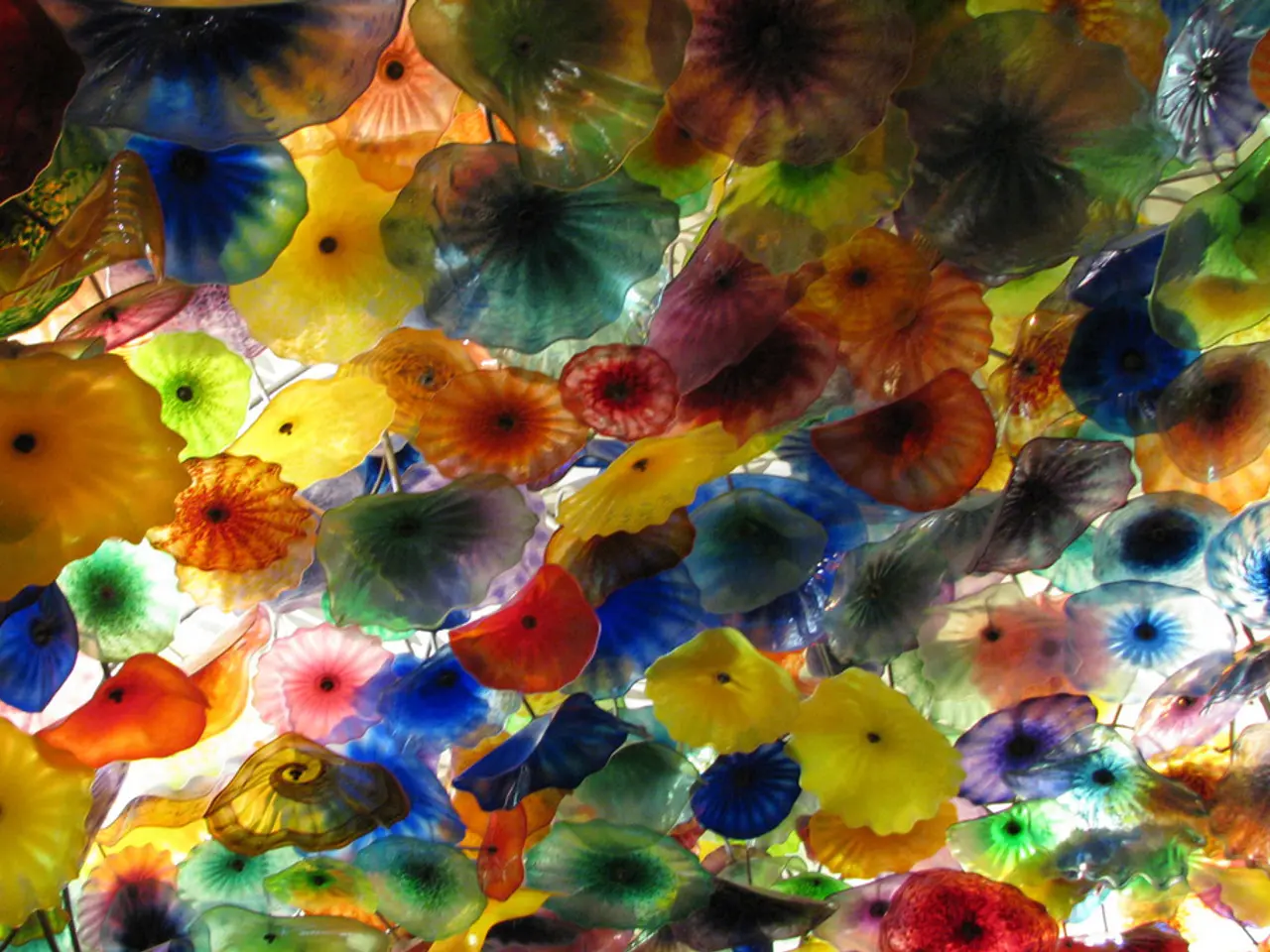
Creative Ceiling or Wallpaper Designs
Using triadic colors in wallpapers or painted ceilings creates unique, lively accents that enhance spatial perception and room character. These creative designs can elevate the overall aesthetic of a space, making it more dynamic and engaging.
Effective Implementation Tips
To ensure a successful implementation of triadic color schemes, there are several tips to consider:
- Adjust saturation and brightness: Instead of using fully saturated colors, use muted or darker versions to suit the room's mood and lighting conditions.
- Balance color dominance: Choose one color as the dominant hue and use the other two in smaller amounts to avoid clashing or chaos.
- Integrate neutrals: Neutrals like gray, white, or beige can buffer vibrant triadic colors and prevent overstimulation.
- Spread colors thoughtfully: Employ triadic colors across furniture, walls, decor, and textiles in a way that promotes harmony and flow within the space.
- Consider historic and natural palettes: Older color models with soft transitions and hand-blended shades can inspire more natural and comforting triadic schemes than digital wheels.
Breaking the Rules
While rules are important in interior design, they can also be broken. It's possible to mix a very muted version of one color with a bold, saturated version of another color. An example is a creamy white acting as a yellow on the walls, a bold, saturated blue seen in a cobalt sofa, and deep, dark reddish browns as the 'red' in tiny touches.
In summary, triadic color schemes offer a balanced contrast and versatile palette solution in interior design. By thoughtfully adjusting and harmonizing the colors rather than applying them at full intensity, designers can create interiors that are vivid yet relaxing, lively yet balanced.
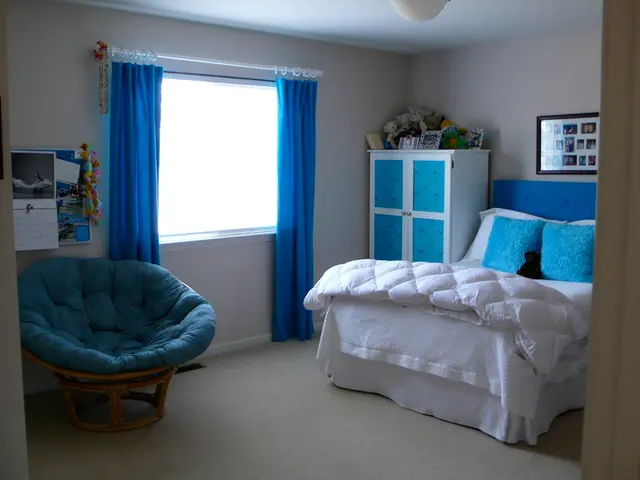
- Incorporating the triadic color scheme in interior design, a designer might use red, yellow, and blue in the living room, creating a vibrant and balanced space that avoids extreme contrast.
- To add visual interest without overwhelming, a designer can use a muted green as the dominant color, complemented by a bright orange and a deep violet in decor and accents.
- Tiles in the kitchen can be arranged in a triadic color scheme, with colors like brown, yellow, and blue, enhancing the room's character and creating a dynamic, engaging atmosphere.
- By using art pieces, mirrors, and strategically placed decors, a designer can create a cohesive living room with a triadic color scheme of purple, yellow, and green, ensuring the color scheme feels harmonious rather than chaotic.
- In the home-and-garden lifestyle, a triadic color scheme in the interior design can extend to the home and garden's overall aesthetic, with colorful flowers that align with the kitchen's triadic tiles or living room's triadic wallpaper.


