Top-rated Interior Designers Frequently Opt for Benjamin Moore Blues when Working on Home Interiors
Ready to freshen up your home with some stunning Benjamin Moore blues? Let's dive into the top picks that interior designers adore!
Benjamin Moore is the go-to brand for many designers worldwide when it comes to paint. Known for its high quality, diverse color range, and deep, rich shades, the paint covers like a dream and will infuse your home with vibrant, long-lasting color.
And what's more? Blues are among the brand's best-selling paints. Whether you opt for a deep navy, soft pastel, or electric hue, blues bring timeless and classic vibes to any room. But with so many shades to choose from, it can be overwhelming. So, let's simplify things and check out the most popular Benjamin Moore paint colors, as suggested by the pros.
Dark Blues:
- Hale Navy (HC-154): A classic navy blue, Hale Navy exudes a sense of balance, stability, and reassurance. Popular for decades, this stunning hue seamlessly complements various decor styles while adding a sleek, sophisticated touch. Whether you prefer a traditional neutral or a bold pop of color, this deep blue offers a perfect blend to suit your preferences.
- Reef (1542): This intriguing deep blue-green shade with a hint of gray is a mid-tone color that brings color in a modest, approachable way. Its versatility makes it ideal for any space, from bedroom walls to kitchen cabinets, front doors, and more. This adaptable hue adds a touch of depth and tranquility, ensuring a soothing atmosphere wherever it is applied.
Pale Blues:
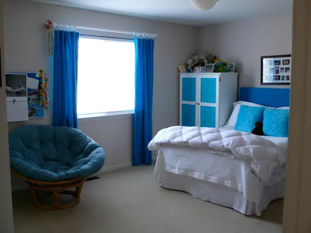
- Palladian Blue: With a soft, soothing appeal, Palladian Blue evokes the calmness of a clear sky or tranquil water. It effortlessly blends with various decor styles, whether you're aiming for a light, ocean-inspired room with creamy off-whites and sandy hues or a cozy, traditional look with deeper navy, charcoals, and warm pops of color.
Designers Pick:
Craving something a bit off the beaten path? These top 10 Benjamin Moore blues, hand-picked by interior designers, are sure to elevate your space with their unique charm and versatility.
- Wales Gray: This soft, watery-undertoned shade can brighten up a light, airy space, serving as the perfect pop of personality without overwhelming the room. It's the perfect hue for creating a modern farmhouse aesthetic, as proven in this guest house example.
- Mysterious AF-565: This rich, enveloping dark blue tone can often appear gray in some lights and blue in others. Its ambiguity adds charm and timeless appeal. Pair it with unlacquered brass hardware to bring out its subtle warmth.
- Van Courtland Blue: This elegant, timeless blue is perfect for painting trim. Its soft undertones create a classic feel in this modern farmhouse kitchen, while the subtle contrast with the walls and warm wood floor adds a touch of elegance.
- Deep Ocean: This richly saturated blue has a beautiful sense of depth. Its cool undertones work particularly well as a backdrop for warmer colors, like yellow and red. Use it to create a cozy, enveloping atmosphere in small bedrooms.
- Nimbus Gray: This cool, calming blue tone works well in a variety of spaces, from nurseries to modern farmhouses. Its simplicity brings focus to architectural details while infusing a touch of character and depth.
- Temptation 1609: This luxurious, near-black wall color trend highlights rustic elements to create an atmospheric, moody quality. Use it to add a touch of sophistication to your living room.
- Patriot Blue 2064-20: This classic dark blue brings a versatile anchor to any room, adding both drama and tranquility. Pair it with warm neutrals like soft beiges and creamy whites for a harmonious, balanced aesthetic.
- Yarmouth Blue HC-150: This light, airy shade is perfect for an all-over application like bathrooms, as it evokes a sense of calm, freshness, and tranquility.
- Woodlawn Blue HC-147: This soft, subtle gray-blue shade adds sophistication, yet maintains an airy, inviting feel, especially in bedrooms. Pair it with Chestertown Buff HC-9 for a chic, earthy palette that complements rustic and modern designs alike.
- Hale Navy HC-154: A perennial favorite, Hale Navy adds a hint of navy charm to doors, door trim, and kitchen cabinets, lending a sophisticated, timeless touch to your home.
With so many stunning blues to choose from, you're sure to find the perfect shade to make your home shine. Embrace the power of color and let Benjamin Moore blues elevate your space!
- For a standout interior design, consider painting your kitchen cabinets in the deep blue-green shade of Reef (1542). The versatility of this color will create a soothing atmosphere.
- If you're drawn towards a rustic living room aesthetic, Temptation 1609, with its near-black wall color, can highlight rustic elements for an atmospheric, moody effect.
- Interested in a trendy kitchen design? The intriguing tile patterns paired with Deep Ocean, a richly saturated blue, can create a cozy, enveloping ambiance.
- Incorporating color into your furniture choices can be achieved with soft Palladian Blue. This palette will bring an ocean-inspired vibe to your home and easily blend with diverse decor styles.
- The master bathroom can be transformed with the airy and light Yarmouth Blue HC-147, which evokes a sense of calm and freshness.
- When it comes to art, Palladian Blue offers an optimal background that highlights various art pieces, blending seamlessly with diverse styles.
- For those exploring a more modern farmhouse style, consider incorporating Wales Gray and Van Courtland Blue into your interior-design-lifestyle. The soft hues can brighten up living spaces while adding a touch of charm.


