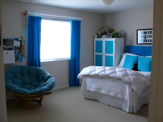
Vibrant Scandinavian Designs Demonstrating That It's Far Beyond Minimalist White Spaces
Mia Karlsson, a renowned interior designer, leads a team of creatives to bring her signature Scandinavian sensibilities to clients across the globe. With over three-hundred projects completed since starting her firm in 2004, Karlsson's work is a testament to the timeless appeal of Scandinavian design.
In Scandinavian design, balance is paramount. Complementary colors can create an exciting contrast, but it's best to use one main dominant shade in a space and others as more of an accent. A simple trick is to keep the color palette simple, picking out just a few colors from a design and incorporating them throughout to create balance and harmony.
Typically, the base colors are desaturated, neutral tones such as pale whites, soft grays, warm earthy taupes, or muted greens and blues. These provide a calm and natural foundation. Color accents appear in smaller elements like rugs, cushions, or art, and layering different textures (linen, wood, woven fibers) enhances depth and warmth without overwhelming the space.
When it comes to colourful interiors, using a cohesive palette of three to four colours is key. One main base colour, usually on the walls, sets the tone. Additional colours can be layered in through textiles, furniture, and accessories. This maintains the Scandinavian focus on balance, simplicity, and a sense of order while allowing joyful pops of colour.
In spaces designed for creativity or study, blue is an excellent anchor colour that works well in both natural and artificial light, and combines easily with other colours. The orange and green colour combination can bring a sense of rhythm to a space, with one warm colour and one cool colour creating visual balance.
Art plays a pivotal role in informing the design narrative for many projects. Colours in art can echo surrounding interiors and become the starting point for a colour palette. Life is simply better in colour, according to Karoline Nygaard Petersen, who believes that being surrounded by colour makes her happier.
In addition to walls, other surfaces can be used to introduce colour. Using colour on cabinetry rather than the walls can highlight the joinery as a design feature in its own right, creating a sense of calm and intentionality. Painted ceilings can be used to create a moment of surprise, drawing the eye upward and transforming the feel of a room. A monochrome palette consisting of one base colour in different shades can be used to create a cozy and intimate space, with darker shades on the ceiling and lighter ones on the walls for a modern, calming effect.
To balance colour in a Scandinavian-inspired colourful interior design, it's essential to exercise restraint by combining modern and vintage, light and dark, natural and industrial elements to create eclectic but harmonious looks. Incorporating natural materials (wood, stone, leather) with clean lines keeps the space functional and inviting. Sampling colours under different lighting conditions before committing ensures harmony throughout the day.
By following these tips, you can preserve the Scandinavian aesthetic of calmness and simplicity, while introducing colourful, playful, or maximalist elements in a structured and tasteful way.
- Mia Karlsson, known for her Scandinavian sensibilities in interior design, often uses a simple color palette in her projects to create balance.
- The fundamental color palette in Scandinavian design consists of desaturated, neutral tones like pale whites, soft grays, and warm earthy taupes.
- Accents of color can be introduced through elements such as rugs, cushions, or art, while layering different textures enhances depth and warmth without overwhelming the space.
- In Scandinavian-inspired colorful interior designs, it's essential to combine modern and vintage, light and dark, natural and industrial elements for an eclectic but harmonious look.
- Art can play a pivotal role in informing the design narrative for many projects, with colors in art echoing surrounding interiors and becoming the starting point for a color palette.
- In spaces designed for creativity or study, blue is an excellent anchor colour that works well in both natural and artificial light, and combines easily with other colours.
- Painted ceilings can be used to create a moment of surprise, drawing the eye upward and transforming the feel of a room.
- When it comes to colourful interiors, using a cohesive palette of three to four colours with one main base colour on the walls is key, while maintaining the Scandinavian focus on balance, simplicity, and a sense of order.


